- Home
- Modules library
-
Log in or create an account to avoid losing your wishlist
CMS MODULES LIBRARY
This library lists all the modules available in our CMS.
It is intended for designers and contributors. For each module, you will find its display on the front end as well as its configuration in the back office.
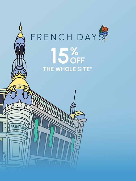
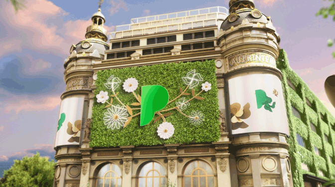
THE BUBBLES
THE BLOCKS X4
Portrait block
Landscape block
THE BLOCKS X1, X2 AND X3
Block X1
A SIMPLE IMAGE

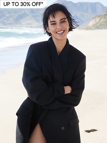
HEADBAND
Headband editorial block
SPOTLIGHT ON THE TRENDBARBIECORE
On the occasion of the movie releaseBarbiein theaters, embrace the look of the world's most popular doll.
Standard bandeau

to take advantage of exclusive offers, surprise gifts and private invitations,
personalized services and special shopping days.
Carousel headbands
TREND SPOTLIGHTBARBIECORE
In celebration of the release of the Barbie movie in theaters, embrace the look of the world's most popular doll.
OFFERS BANNERS

From XX July to XX August
FOR ANY NEW SIGN-UP TO OUR LOYALTY PROGRAM
From XX xxxx to XX xxxx
From XX xxxx to XX xxxx
-XX%
ON BEAUTY OR LINGERIE
Immediate discount, valid in
stores and on Printemps.com
See conditions
SHOP NOWFOR ANY NEW SIGN-UP TO OUR LOYALTY PROGRAM
From XX July to XX August
Offer 3 Box
From XX July to XX August
FOR ANY NEW SIGN-UP TO OUR LOYALTY PROGRAM
FOR ANY NEW SIGN-UP TO OUR LOYALTY PROGRAM
FOR ANY NEW SIGN-UP TO OUR LOYALTY PROGRAM
PRODUCT MODULE/SELECTION
Standard selection
Trade selection (image on the left)
cta

This is a paragraph for the editorial
TEXT MANAGEMENT
Toggle or dropdown list
SIMPLE PARAGRAPH
Standard simple paragraph
Title Huge
Title Large
Normal Paragraph
Lorem ipsum dolor sit amet, consectetur adipiscing elit. Curabitur non sapien ut est tincidunt vestibulum. Fusce ut lobortis sem, eget auctor sapien. Mauris suscipit congue iaculis. Nam et ullamcorper purus. Etiam non magna eget purus commodo semper. Pellentesque tortor mi, volutpat vel mi nec, blandit sodales nulla. Donec sem quam, finibus nec tellus accumsan, ultricies vestibulum arcu. Ut suscipit augue lorem, ut rutrum orci tristique nec. Proin accumsan semper dolor, id porttitor lacus efficitur in. Aliquam sed facilisis tortor, at elementum lectus. Quisque tempor, mi ac tempus facilisis, erat dolor vehicula sem, non rhoncus magna augue eu felis.
Small Text
Lorem ipsum dolor sit amet, consectetur adipiscing elit. Curabitur non sapien ut est tincidunt vestibulum. Fusce ut lobortis sem, eget auctor sapien. Mauris suscipit congue iaculis. Nam et ullamcorper purus. Etiam non magna eget purus commodo semper. Pellentesque tortor mi, volutpat vel mi nec, blandit sodales nulla. Donec sem quam, finibus nec tellus accumsan, ultricies vestibulum arcu. Ut suscipit augue lorem, ut rutrum orci tristique nec. Proin accumsan semper dolor, id porttitor lacus efficitur in. Aliquam sed facilisis tortor, at elementum lectus. Quisque tempor, mi ac tempus facilisis, erat dolor vehicula sem, non rhoncus magna augue eu felis.
Simple paragraph centered
Lorem ipsum dolor sit amet, consectetur adipiscing elit. Duis ac scelerisque mi. Nunc sem neque, maximus nec magna ornare, sagittis suscipit neque. Sed vehicula vehicula elit, sed pellentesque mi tincidunt nec. Nunc eleifend auctor hendrerit. Proin egestas odio leo, nec euismod erat scelerisque sit amet. Morbi a arcu tempus metus iaculis pellentesque eget ac lectus. Pellentesque id risus metus. Etiam vitae leo justo. Phasellus pretium quis dui non efficitur. Maecenas ut posuere mi. In euismod commodo lacus. Praesent nec purus ipsum. Phasellus eget tellus a tellus pretium venenatis eget et eros. Vestibulum finibus varius placerat.
Now is the time for maximum, with lorem as the base, and a focus on the flow. Proin eget ante eget nisi molestie vulputate eu nec lectus. Duis non nisl cursus, venenatis odio quis, semper dolor. Phasellus ullamcorper maximus enim, nec lacinia dolor aliquet et. Pellentesque habitant morbi tristique senectus et netus et malesuada fames ac turpis egestas. Etiam facilisis ipsum ac augue imperdiet pellentesque. Sed congue sodales purus, eu facilisis dolor imperdiet non. Suspendisse tempor eu risus nec viverra. Donec id velit porttitor purus sollicitudin convallis eu a nulla. Nam dolor tellus, egestas id lacus in, mollis finibus nunc.
SIMPLE PARAGRAPH
This module allows you to create a subtitle + text area.
BO Configuration :
MODULE INFO :
DISPLAY TYPE : STANDARD OR CENTERED
CONTENT :
1/ TEMPLATE "SIMPLE PARAGRAPH"
SECTION :
SECTION = CHOICE BASED ON NEED
Title - Textarea - Cta List
HTML Title
traduit en anglais Lorem ipsum dolor sit amet, consectetur adipiscing elit. Curabitur non sapien ut est tincidunt vestibulum. Fusce ut lobortis sem, eget auctor sapien. Mauris suscipit congue iaculis. Nam et ullamcorper purus. Etiam non magna eget purus commodo semper. Pellentesque tortor mi, volutpat vel mi nec, blandit sodales nulla. Donec sem quam, finibus nec tellus accumsan, ultricies vestibulum arcu. Ut suscipit augue lorem, ut rutrum orci tristique nec. Proin accumsan semper dolor, id porttitor lacus efficitur in. Aliquam sed facilisis tortor, at elementum lectus. Quisque tempor, mi ac tempus facilisis, erat dolor vehicula sem, non rhoncus magna augue eu felis.
CTA
Heading from H1 to H6
H1 Title
Title h2
Title h3
Title h4
Title h5
Title h6
FAVORITE STORE

This is a text

STEP 3
Complete the online form,
you have no documents to provide
Title 1
PLAYER VIDEO
Nav Thumbnail
Exceptional Message

THE LITTLE GIFT
For every order placed on Printemps.com, we offer you a miniature Acqua Di Parma fragrance, while stocks last.*
Newsletter
Html Showcase
Since its creation in 1865 by Jules Jaluzot, assisted by his wife Augustine, Printemps has never stopped reinventing itself. Anticipating major societal changes, serving everyone, enhancing beauty by promoting more responsible consumption, and offering a perpetual sense of surprise.
In 2022, Printemps continues to look confidently towards the future and boldly celebrates its renewal, because now more than ever, it all begins in Spring! New visual identity, new color codes, new spaces, new services, new concepts, and hundreds of new exclusive and unprecedented products like the first time... Printemps is transforming.
Footer Link List
Footer Reassurance
Footer language block
You are on the website :
You are browsing in :
Brand module
Form
catalog.requiredFields
The companies Printemps SAS and BPCP process your data, as joint controllers, for the organization of the game and, with your consent, for sending commercial communications. To learn more about how your data is managed and to exercise your rights, please refer to our 'Personal Data Protection Policy' available on the site: https://www.printemps.com/fr/fr/protection-donnees-personnelles
Thank you for your participation! You might be our future winner!
Push Edit
Live Shopping
THE SECTIONS
The sections assigned to a module type
Some modules require the use of a specific section to function, here they are:
BULLES Section => Bubbles template
ENCART-PRINCIPAL Section => Main banner template
FOOTER Section => Reassurance footer template
FOOTER-GRIS Section => Links list footer template
TOGGLE Section => Toggle title description template
EDITO PRODUIT Section => Only in editorial for product + simple image
For all other sections, their use is free and not subject to a specific module, we will see how they work.
The unaffected sections
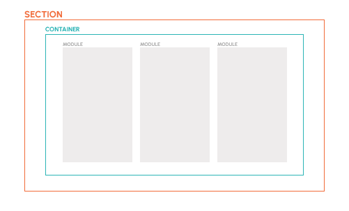
A section is a block that contains one or more modules.
There are different sections to better manage the display of modules relative to each other (in columns, in rows, with margins, gray background ...).
Here is a detailed description of the behavior of each section not affected.
the section ONE-LINE-DESKTOP has the following behavior:
=> No margin for the section, option for full screen
=> The container takes the full width of the content and is centered on the page.
This means that the total width of the modules defines the width of the container. The content is centered.
For example, if the section contains two modules that each measure 500px.
The modules will sit side by side and center on the page.
If, on the other hand, the total width of the module(s) is 100% of the page width, the section will be in full screen.
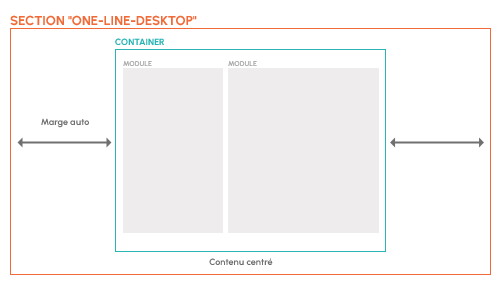
ONE-LINE-DESKTOP
The section ONE-LINE-DESKTOP-WITH-MARGIN has the following behavior:
=> The section has a maximum width of 1660px
=> The container takes the full width of the content and centers on the page if it is less than 1660px
=> Full screen gray background for the -GREY
For example, if the section contains three modules that each measure 1660px.
The modules will sit side by side. On a 1920px wide screen, there will be margins on the right and left.
In the case of a screen smaller than 1660px, the container will take the full width of the page (minus the site's auto margins) and the size or position of the modules will vary depending on their nature. They may, for example, shrink or wrap.
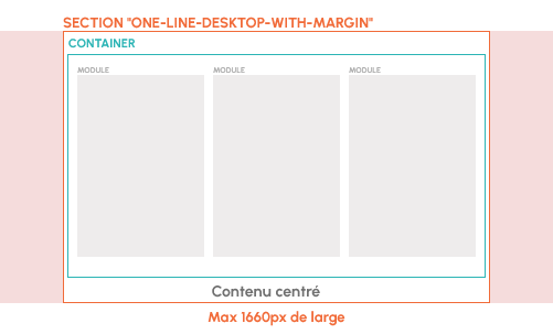
ONE-LINE-DESKTOP-WITH-MARGIN
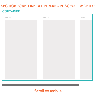
The section ONE-LINE-WITH-MARGIN-SCROLL-MOBILE has the following behavior:
=> The section scrolls on mobile
For example, with this section, a container of 3 blocks will scroll the content on mobile
The section DESKTOP-WITH-MARGIN has the following behavior:
=> The section is a maximum of 1660px wide
=> The container takes the full width of the content and centers on the page if it is less than 1660px
=> If the width of the modules is greater than the container, the modules will wrap and center
For example, if the section contains three modules that each measure 1800px.
The first two modules will sit side by side and the third will wrap to the next line.
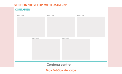
DESKTOP-WITH-MARGIN
The section ONE-LINE-DESKTOP-INVERSED-WITH-MARGIN behaves as follows:
=> The container reverses the position of the blocks on mobile
For example, if we have a text block followed by an image on desktop. (1 then 2)
On mobile, we will have the image followed by the text (2 then 1)
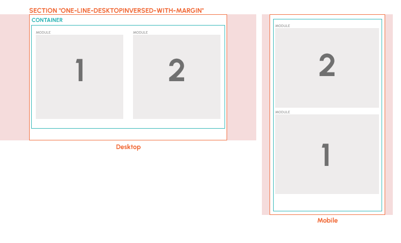
ONE-LINE-DESKTOP-INVERSED-WITH-MARGIN
Edit two images


Edit Text + image
Edit 1 product
EDITO paragraph
two-column magazine